Week In Review For Townhomes In Vancouver


This is Day 178 of the Slow Home Project and we need you to join us in our quest to evaluate the design quality of houses in nine North American cities in nine months.

We have lots to do this Friday!

First of all, we want to thank everyone who submitted a Design Project scheme from last Wednesday. Again, the quality of the work keeps getting better and better. This week, we thought we would comment on who we felt had the 4 best schemes as well as highlight what we thought were the 5 most interesting ideas on how to improve the space of this townhouse design.

To see what the townhouse plan looked like before everyone re-designed it, click on the link below.

Here are the 4 best overall schemes this week:

1. This is one of 3 plans submitted by Jim Baer and we felt it was the best scheme submitted this week. He added a guest bath at the entry which defined the entry and also provided some definition around the stairs. The best idea in this plan is the millwork wall the includes the back counter of the kitchen, a study desk and some dining room storage. Overall, an innovative and elegant solution!
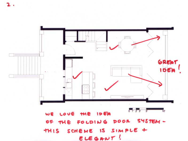
2. This plan is from Frances and her idea to use a folding wall system to really connect the interior to the exterior transforms the whole nature of the project. The plan is simple, elegant and sophisticated. Also, thank you Frances for posting the image of the sliding wall system so we can better visualize your concept.
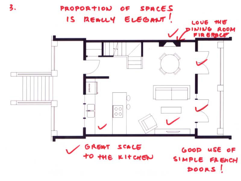
3. Molly K’s plan has the best spatial proportion of any of the schemes submitted – everyone should study her plan and see how nicely the kitchen, living and dining spaces are all scaled!

4. Nicole’s kitchen layout is outstanding – her placement of the appliances is extremely efficient and she has really thought through all the details of how the kitchen would function. It is worth it for everyone to have a look to see how well the appliance triangle is designed!

The following 5 projects deserve recognition for some really innovative ideas:

1. Murray’s plan uses the fireplace as an object to define the entry space and the dining area without adding walls of closing in any rooms. It adds definition while keeping the overall plan appear open.
2. Mid America Mom has created a focal point for the living room by placing a TV on the back of the entry wall – this creates a nice relationship for someone sitting on the sofa – allowing them to watch TV and look at the view at the same time.
3. Grace has placed the kitchen in the center of the plan – a great idea because it defines the three spaces of dining, living and study really well without the need to add walls or other elements.
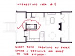
4. Franco has placed a guest bath right at the entry – which defines the entry, adds an additional functional element, organizes the kitchen and creates a clear circulation zone from the entry to the stair.
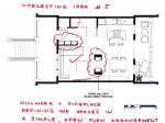
5. Tara has used a millwork bookshelf and a see through fireplace to give definition to the entry and the living/ dining area. These features define space without enclosure.

Now, to reveal who is the Slow Homer of the Week for July 15, 2010, click on the link below.

We also need you to vote for who you think should win the Slow Home Award for Best Townhouse Design in Vancouver. Study the links of the nominees below and cast your vote – we also want you to post a comment as to who you think should win and why!

We need your vote!

Choose the Slowest home

Loading ... Loading ...

And finally, we are pleased to be releasing the video of the Slow Home Award Winner for Editor’s Choice from Miami! John and Matthew interviewed Joyce Belloise and Jack Kelly, the producers of the eye opening new documentary “Imagining A New Florida” which examines the impact and future of Florida’s rapid growth both before and after the collapse of the housing market. Enjoy this segment and we look forward to your comments on this video as well!

Sage – Typical Townhome
The Hub – Townhouse A
Pomaria – Plan TH-B

See you on Monday, where we will be reviewing single family homes in Vancouver – our final week in this west coast Canadian city!

  • Mid America Mom

    Grace congrats on the award. Jim Baer you conquered the bath AND study challenge!

    Matthew and John the video is a great compliment to the NON design result of Miami. I want to point out there is some hope with the work of the new urbanism folks in Florida – http://www.cnu.org/

    *********
    Could we please also have links to the finalists, outside the voting box? Once we vote we have no idea what project is nominated. I like going back when someone points out a specific element or flaw. Below are links.

    SAGE (look at last page) http://www.sageliving.ca/_pdf/Sage_Floorplans.pdf
    And the main site http://www.sageliving.ca/

    The Hub – http://www.libertyhomes.ca/thehub/pdf/052_hub_tha.pdf
    And the main site – http://www.libertyhomes.ca/thehub/

    Pomaria TH B – http://www.pomaria.com/view_engine.html

    I voted for the HUB. I love what they accomplished in under 1000 sq feet.
    ***********

    Mid America Mom

  • Terri

    Jim Baer, Great plan! I like not only that you put a powder room on the main floor (anyone reading yesterday’s discussion on this will know why I say this), but you also kept a full height window in the front of the plan. I put the kitchen there and realized later that I’d substantially reduced the amount of light that could enter the home (in Vancouver, access to light is important as rain seems to swallow it up!). I also like that the powder room hinders a direct view into the living room, something that I didn’t like in my plan either. Finally, I like your balcony doors. As much as the french doors are lovely, they impede furniture arrangement on the balcony.

  • Terri

    Grace Coulter,
    Congrats on being Slow Homer of the Week! Like John and Matthew, I also like to read the comments that people post with their reviews. Sometimes I’m in too much of a hurry to offer much thought, but I do appreciate those who take the time to point out the subtleties in a plan and also how that plan fits into the broader context of the place.

  • Franco

    Great job everyone on the submissions this week, especially our top 4 finalists. The plans are fabulous.
    I love Frances folding wall concept, it’s a great way to really unify the indoor and outdoor space.

    For the voting this week, I went with the Sage, in this plan I really liked how spacious it felt and just how well everything worked and fit. It’s nice to see 3 bedrooms plus a study and a powder room on the main. The roof top terrace in addition to the large patios, offer exceptional outdoor living space. My only criticism with the plan is that I don’t like having to enter the flex room to access the stairs from the garage on the lower level.

  • Terri

    I like the Hub’s layout best, but I’m a little confused by the plan as shown on the website. It doesn’t indicate front windows in the Living Room, only a side window. And upstairs the second bedroom seems to show a window only where the closet is located. Can we assume that there are front windows, as the building elevation seems to suggest?

    (M.A.M.–Thanks for posting the websites for the nominees above!)

  • jim baer

    thanks john and matthew for the “best design this week” nod and to all others for their cudos and comments. “innovative and elegant” makes me fee good. it is something i strive for.

    i do feel like a little bit of a cheat though…..because i am an architect with a fair amount of experience in residential design…. should i be taken out of the running?

    i am always impressed by the quality of the designs and all the things i see that i say “..hey nice idea…i never would have thought of that!”

  • Terri

    Okay, I opened the link from another location and got a better resolution. I vote for Hub then. I like the separate Entry, the separation of bedrooms and living and the storage space not being labelled “Flex.”

    Although Sage put quite a lot in 783 SF, I feel the kitchen is too small and too close to the entry, and I really don’t like a desk being shown in that closet off the kitchen.

    The Pomaria didn’t advertize any Environmental features, and the space is long and dark on the main floor. I reviewed a similar townhouse (James Living) but they at least tried to put in a lightwell at the center, and they had Silver LEED certification.

  • Matthew North

    Jim – I think it is great to have a real life architect participate in the Design Projects every week – I want more architects to participate as it raises the bar for everyone and we can all learn a lot from each other’s schemes! I am amazed at how innovative the various solutions each week and always look forward to the next!

  • jim baer

    terri

    thank you.

    i went back and read yesterday’s discussion on 1/2 baths. i have to say that i am a fan of 1/2 baths on the living levels, even so far as to say that all almost all living levels should have access to a toilet and a sink. as my parents age, and more directly as i get older, i can see the need for an easily and readily accessible powder room. i have been a guest at houses that did not have a toilet on each level and have found those trips up and down the steps to be a pain in the …… maybe it is all the beer i drink when i “visit” and “socialize”….

    i also don’t have a problem with the “dumbell” designs. though they do need either an out swinging door or a pocket door. they just aren’t large enough for the door to swing in.

    for me the biggest issue is privacy. both for the user and the other occupants of the house. that is why i always try to tuck them away. entrances seem to be a good place for them. they tend out be out of the way, and are also good for those “last one for the road” stops…

  • Terri

    Jim B,
    I don’t think the fact that you’re an architect should matter. John and Matthew are architects too. I think it’s great that you’re participating in the site and don’t consider the others’ ideas a waste of your time.

    John & Matthew,
    I enjoyed your Florida interview. It’s piqued my interest to watch their documentary when I find the time, so thanks for the link too. I was wondering if we’ll be seeing anything from Dallas eventually, as it’s the only city not featured in a video so far.

  • Matthew North

    Terri – John and I have not been out to Dallas yet to give out the Slow Home Awards – hopefully we will be making that trip in the next short while!

  • Terri

    Jim,
    Just saw your comments regarding the 1/2 bath. I like the entry location too, for the privacy and also convenience of getting home “just in time” too! (It’s not from drinking beer in that case–haha–just having a bladder the size of a pea.)

  • Amanda

    Congrats Grace Coulter! I liked your plan because you came up with a new idea that no one thought of previously; the kitchen in the center. It made me realize that there are so many different ways to design the same unit.

    I voted for Liberty because it had the most pros. My only concern with it is the fact that the main level has no guest bathroom and that the upper level has some wasted space taken by the long hallway.

  • Andrew

    Some great design challenge submissions this week.

    Unfortunately the Pomaria floor plan page would not open for me, so it’s between Sage and The Hub for this one. This was a bit of a tough decision given that there is such a difference in size between the two homes. The Hub has a nice and neat organization and the smaller floor area has been dealt with effectively, but ultimately my vote is for Sage. The organization is really well done and it has a fantastic amount of outdoor living area. Even the flex/study space in Sage looks properly designed with a great deal of natural light through the window that overlooks one of the balconies. In this case, the ‘flex’ label doesn’t do this space justice. And even though this townhome is long and narrow, it looks like all the principal spaces would receive a good amount of natural light.

    Mid American Mom already pointed this out, but it should be noted again that you have to scroll to the last floorplan in the link provided for Sage to view the townhome plan. It looks like some people are reviewing/describing one of the ‘unit’ floorplans today and not the Sage townhome.

  • Tara

    Great job this week everyone, a lot of enjoyable and well resolved plans.

    My vote this week is for Sage. I liked the overall simplicity and resolution of the plan. The only shame in this plan is the treatment of the entry from the garage. The other two entries are treated beautifully so its unfortunate that the same thought was not put into the entry that would be used the most. Nonetheless, I think it’s a very nice townhouse layout.

  • Kyle B

    Voting for the Slow Home Award for Best Townhouse Design in Vancouver was easy for me this week. I didn’t like how one would have to run down the stairs from the bedroom to the bathroom in the Pomoria, so that one was out.

    When comparing the the Hub to the Sage, it is less than half the size with only one less bedroom and no powder room. I feel that the Hub successfully tackles a significantly harder task than the Sage. For this reason, I voted for the Hub.

  • Grace Coulter

    Thanks for the congrats guys! Pleasant surprise on a Friday. I have learned from others that going behind the scenes in these cities can drag up some good information and I am glad people are finding the posts useful.

    So of the top four houses this week I would be happy to reside in both Frances’s and Nicole’s designs. The treatment of the back facade is great! I love the idea of having such an open house. It is difficult to communicate this in a 2d plan but I imagine the connection with the outdoors would create the illusion of a much larger space. I also think in Vancouver this could really work. The climate is mild enough that the heating costs of having such large glass facades would not be overly problematic (as opposed to saying foing this design further west in Canada). Nice layouts ladies.

    jim baer – I think that having design professionals only increases the usefulness of the site. It allows for everyone to get a range of opinion expertise in. I am personally studying architecture in school right now and this website is acting to further my understanding of residential design immensely. For me this has been an opportunity to learn about something I would like to eventually do professionally but hadn’t found in architecture school thus far. Having professional architects post their insights only adds more value for the rest of us trying to learn. Cheers.

    As for my vote this week I am going to pick sage. Great outdoors space. The one top bedroom is a bit tight and I don’t like the dark basement room but that could be used for storage, music or a dark tv room I suppose. Still despite the drawbacks I find this plan the most appealing. I was also impressed that the main site had an entire section devoted to sustainability.

  • Tayler

    I was conflicted between the floor plans of Hub and Sage. They both appeal to me. I really don’t like how the washer/dryer unit is in the washroom in the Sage. However, I ended up picking Sage because of their commitment to sustainability and the outdoor space. I also really like where it is on campus.

  • Tayler

    Jim, I think it’s great we have more design professional’s on here. I can learn a lot more then!

  • frazer

    I voted for the Hub. It has the most clearly defined spaces and better overall circulation. Unlike the other plans the Hub does not have bedrooms/bathrooms opening up into the main living areas which is a hard thing to do with so little space to work with.
    Have a good weekend everyone!

  • ReneP

    I had to go with the HUB – as a slow home, it doesn’t waste space and is a functional and smart design – - if I were voting with my heart though, the Sage would be my ‘dream home’- roof top patio and two terraces, plus the layout of the bedrooms and the nice ‘flex’ room were very attractive features for me.

  • Kcull

    I’m also voting for the Hub. As previously mentioned, there is almost no wasted space and I personally really like the overall layout of the entire place.

  • nicole

    Congrats Grace! GOOD WORK!

    Nice to see that there are some townhouses that are a shape other than long and skinny.
    The sage appears quite wide
    Environmental features offered by Hub is minimal, in my opinion. This is something that every development should be offering. It should be a norm.
    Sage has a bit more to offer with attention to building envelope heat gains, water management + landscaping. Good to see other sustainable guidelines. REAP http://www.sustain.ubc.ca/campus-sustainability/greening-the-campus/residential-environmental-assessment-program
    Good on the University for pushing sustainability!!

    Pomaria claims to have followed leed, but does not state if it is certified, platinum, gold or silver. (Stormwater management + material selection.)

    VOTE FOR SAGE

  • Mid America Mom

    Thank you Eric John and Matthew for posting the links to the finalists also outside the voting box.

    *****

    To all the architects out there I am happy to see you participating. Great to see ideas. Also gives us lay people hope that we will see more slow homes being designed and the ability to live in one :)

    Mid America Mom

  • JPod

    I voted for Sage, it is very well designed and the outdoor spaces are very appealing.